Cima
How streamlined checkout & product comparison features increase conversion ratesOther products & projects: WeGo GramCity

Cima is an online-only bicycle retailer specializing in high-end models. Website analytics show potential customers open numerous product tabs and add several items to their carts before ultimately choosing to navigate away from the site.
No budget was allotted. The project took 1 month to complete.
Per the design brief provided by the product manager, the primary users of this product are affluent, 35 to 50-year-old male cycling enthusiasts.
As the sole product designer, I was responsible for writing the research plan, analyzing competitors, conducting secondary research, sketching solutions, designing a prototype, and conducting usability testing.
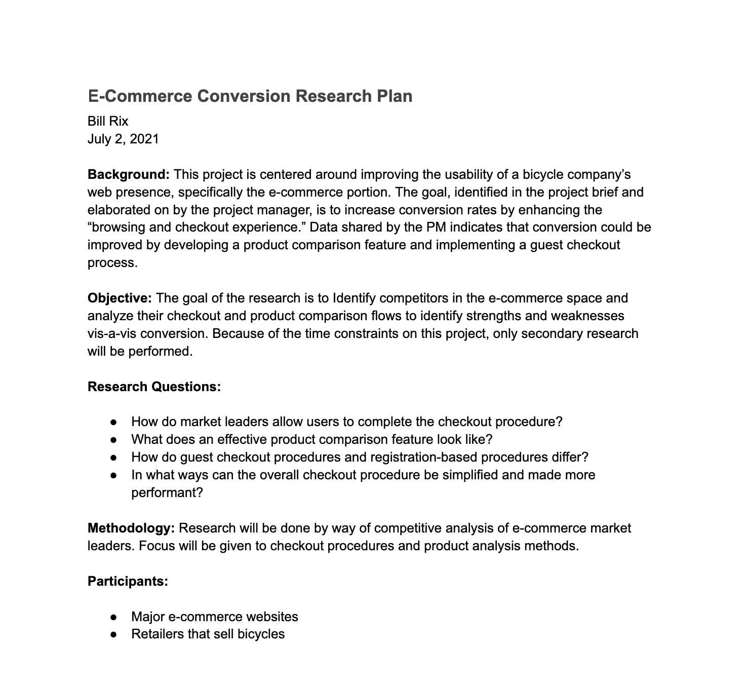
In order to investigate the problems identified in the design brief, I composed a research plan. Amazon and Target were identified as competitors based on their average monthly traffic and net sales in the United States, while Trek was chosen because it operates in the same retail space as Cima. The goal, as stated in the plan, “is to Identify competitors in the e-commerce space and analyze their checkout and product comparison flows to identify strengths and weaknesses vis-a-vis conversion.”
Despite research indicating users prefer anonymous checkout and product comparisons, neither Amazon nor Target offer these features in full. While Trek offers both functionalities, only the anonymous checkout works as expected & I tested the product comparison feature with several devices and it performed poorly on all.
 Research plan Google Docs
Per the design brief, website analytics showed that “70% of users who place an item in the cart do not purchase.” This is in line with data published by Baymard Institute and found on Statista.
The design brief also states, “[d]ata shows that users abandon the cart at the registration page.” Information from Forter and OnePoll (also verified on Statista) shows nearly one-quarter of users abandon carts because of account creation requirements.
As identified in the research plan, Amazon, Target, and Trek were reviewed to understand checkout processes, product comparison tools, and user journeys so as to gain insight on how these key market players implement these features.
Data found on Statista supported the product manager's hypotheses and competitor analysis gave an overview of common and “best practices” regarding the checkout process. This information, as well as information gathered on the UI patterns used on these sites, provided a foundation on which the design would be based.
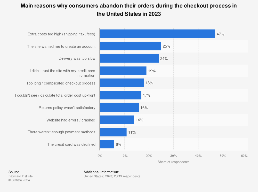 Main reasons why consumers abandon their orders during the checkout process in the United States in 2022 (Statista)
The findings summarized in the research report were distributed via slide deck in order to facilitate sharing with stakeholders. Key insights revolved around competitor analysis findings, as the usefulness of anonymous checkout and product comparison (with regard to increasing conversions) had been previously established.
 Slide deck Google Slides
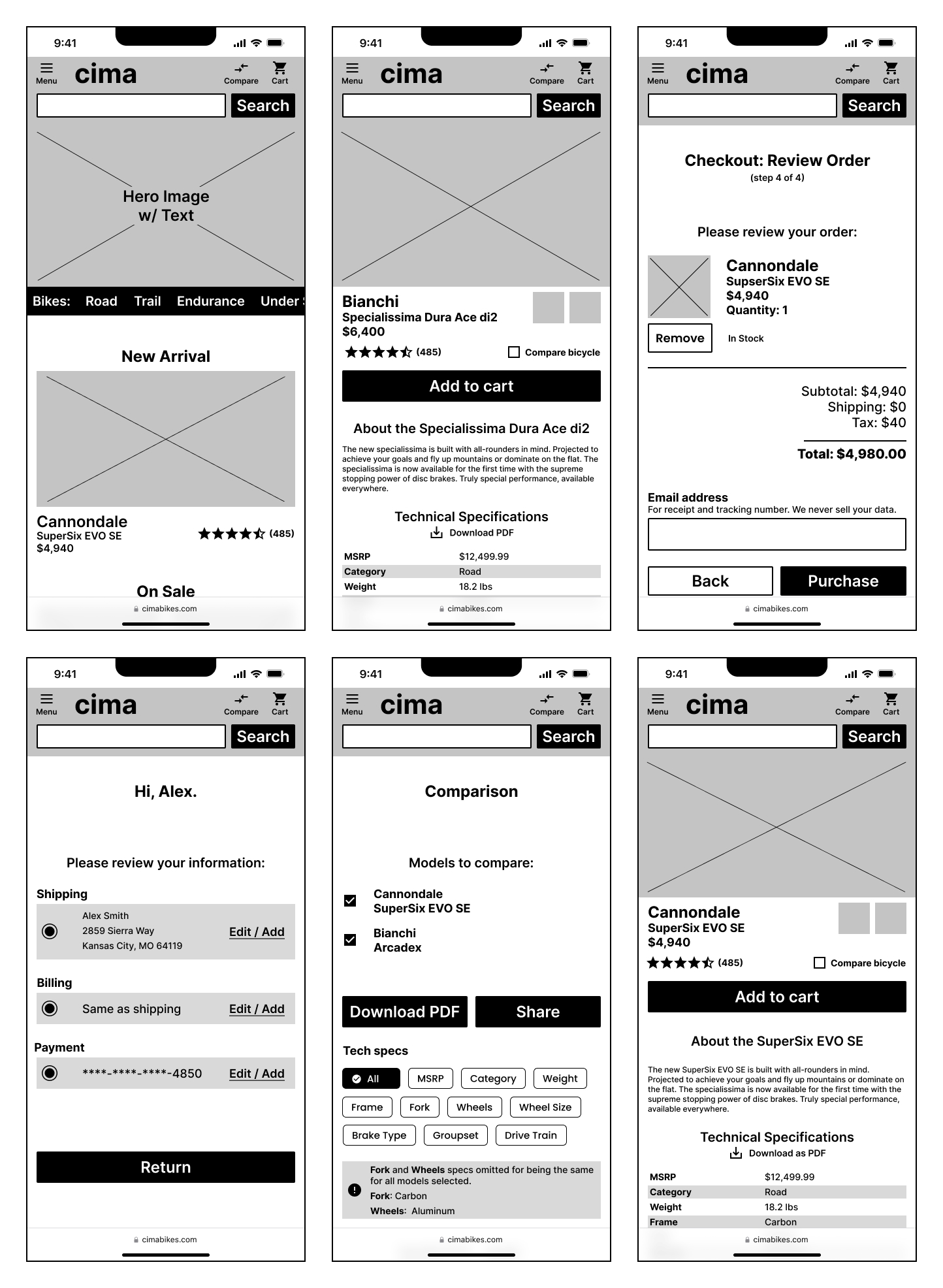
Since I needed to validate whether guest checkout and product comparison features would lead to increased conversions, I built the prototype around these flows. In order to gather metrics for both features, the design allowed users to checkout as both a registered, logged-in user as well as a guest, and featured a product comparison feature to aid decision-making.
100% (5 of 5) users, when given the option, chose the anonymous checkout option. 3 of 5 users stated they preferred this method because they perceived it to be faster.
I used a “one-thing-per-page” flow for the checkout process, and user feedback was positive. The comparison feature, however, had numerous issues — not a single user was able to complete the task relating to this feature.
When asked to compare two road bicycles, users either clicked directly on the “Compare” icon in the header or added a single bicycle for comparison before navigating to the comparison page. On review of the recorded tests, several factors appear to have led to this course of action:
"The thing is ... I see the "Compare" button and I just clicked that. I didn't know I had to select more than one [bicycle]." Jennifer M
"I want it to be super available to me how to get to the comparison [page] ... I want to know where [the items] are going." Julia H
 Low-fidelity screens.
After reviewing the test recordings and summarizing the findings, I designed a high-fidelity prototype. Throughout this process, I regularly tested user sentiment regarding design choices, including UI patterns, spacing, and perceived complexity by sharing quick design examples with those in my design community. Had I used this Lean UX methodology sooner, I would have avoided mistakes relating to the product comparison feature.
Frequent validation culminated in a significantly improved task completion score for the product comparison activity — 5 out of 5 users were able to complete the task without issue, and most feedback related to UI pattern issues.
"I do like how I can filter by [tech specs on the compare products page]." Andrew C
"Just having what I need to compare ... it's so much easier to look at." Tiffany L
 Validating with users.
I chose this project because of my relative lack of knowledge in the e-commerce space and finished with not only a large body of new skills, but a respect for what I mistook for unimportant design aspects. The devil is indeed the details — product comparison isn't as nearly straightforward as it originally seemed.
While direct testing of conversion rates was impossible, as the product did not launch, user reactions to the guest checkout and product comparison indicated conversion would increase because major reasons for cart abandonment found during research were removed.
This project could not have been completed without help from Lewis N, Krupa P, Greg G, Ethan M, Jamie W, Tiffany L, Nancy L, Andrew C, Sharad C, Kaisha G, Pragya S, Julia H, and Jennifer M.