WeGo
Delivering trustworthy, reliable information to the disabled communityOther products & projects: GramCity Cima

Users in the disabled community often face the challenge of finding reliable, up-to-date information about accessible businesses. Oftentimes these users are faced with stale or conflicting reports, leading to frustration and disengagement with society.
The scope of this project included the entirety of product development, from initial idea to end-phase usability testing.
No budget was allotted. The project took 4 months to complete.
The primary userbase of this product are individuals of the disabled community and those peripherally related, including friends, family, and caregivers.
Businesses can also use the app, and are encouraged to add specific information about their establishment to increase visibility and patronage.
As the sole product designer, I was responsible for conducting the research phases, creating all deliverables, and validation.
I interviewed 5 users directly affected by poor accessibility information: Two users who rely on wheelchairs, two users who are Deaf, and one user who is blind. Participants were selected from Slack, Reddit, and personal networks. A common theme among all users interviewed was negative feelings arising from inability to locate trustworthy information.
"[Accessibility information] is valuable for me in terms of when I'm going — how many people are going to be there? What kind of crowds?" Mike B
"And then, when we actually get [to the business], nothing really went as planned, as expected. Oh, and it's like, 'Dude, you told me everything would be arranged.' But it's not okay, so give me my money back, please." Cam R
"There's an accessibility checkmark ... that seems to be the most Yelp specifies. There's no specificity ... about accessing the business itself." Akshaya G
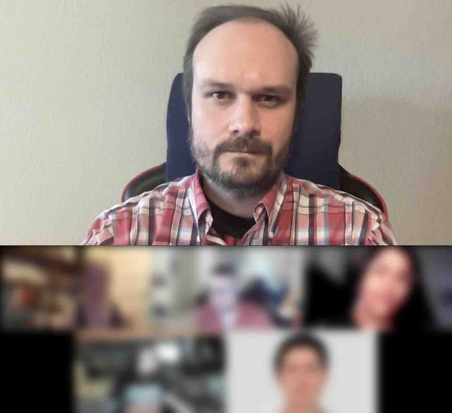 Interviewing users.

Research pointed toward toward the following platforms as competitors:
Their UX strategies were analyzed by directly testing their apps to understand their service design and evaluate their UX choices, user flows, and information architecture.
Secondary research provided insight into the demographics of disabled users, further establishing a clear picture of the user and indicating the design choices I would make as well as what accessibility information I would need to provide in order to provide maximum value for users.
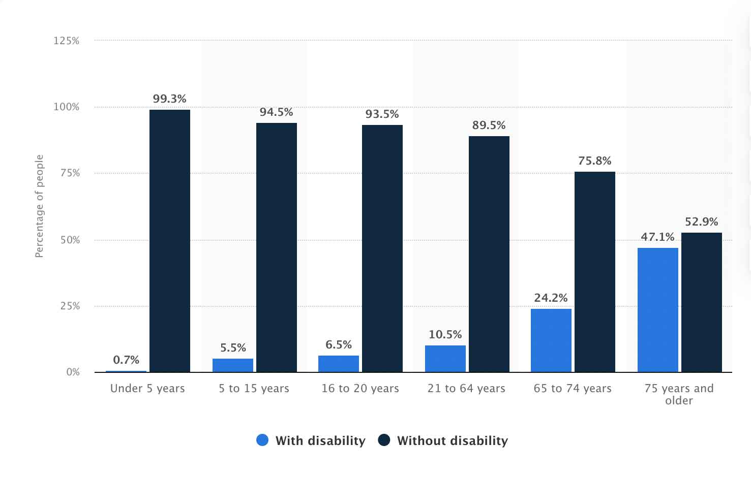 Percentage of people in the U.S. with a disability as of 2019, by age (Statista)
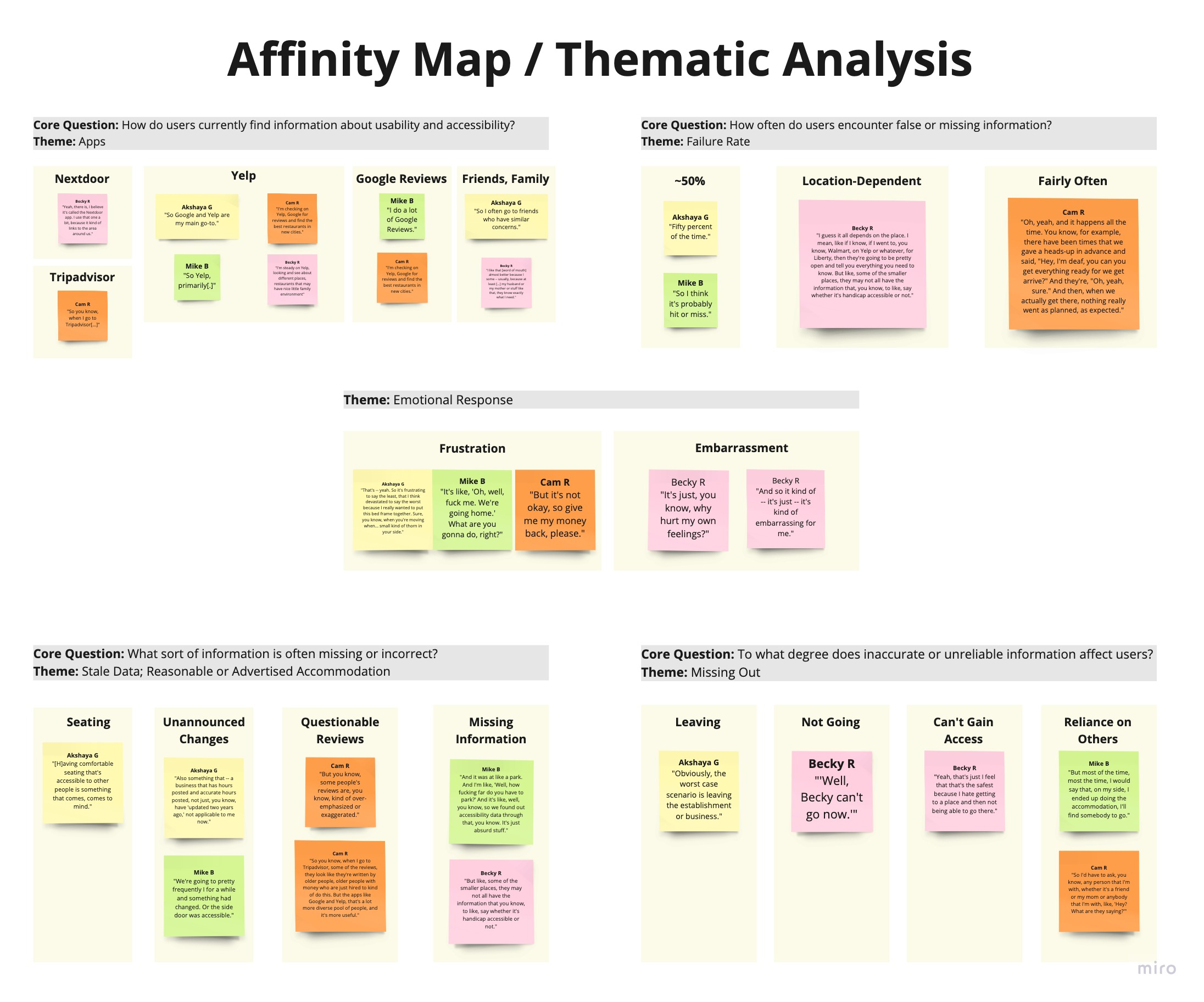
Insights from user interviews were distilled into an affinity map and an empathy map. These artifacts aided in the creation of personas — representations of core users (their needs, frustrations, and goals) — which acted as a coherent vision of the user.
A common theme among all users interviewed was negative feelings arising from inability to locate trustworthy information. Users often mentioned feelings of:
Users' stories painted a powerful picture of the hardships those in the disabled community often have to deal with — stories that stuck with me throughout the entirety of the design process and reminded me who I was designing for and what the goals of the project would be.
 Percentage of people in the U.S. who had a disability from 2008 to 2019 (Statista)
All research indicated users in the disabled community struggled with challenges presented by inaccurate, unreliable accessibility information found on business review websites. To conceptualize how to address these issues, I wrote "How Might We?" statements to help envision solutions.
I am aware of the problems and limitations surrounding HMW statements. In the absence of suitable alternatives, HMWs suffice, but the product designer is aware of their shortcomings.
Having a solid understanding of best practices based on competitor analysis and a clear picture of user needs, I mapped the shortest pathways users would take to accomplish the most common goals (red routes). With that in place, I filled out the rest of the user flow to account for exploration.
With this navigation scheme in place, I devised a sitemap, which acted as a roadmap for moving forward. Throughout this process, I studied and compared competitor flows and identified potential improvements in design.
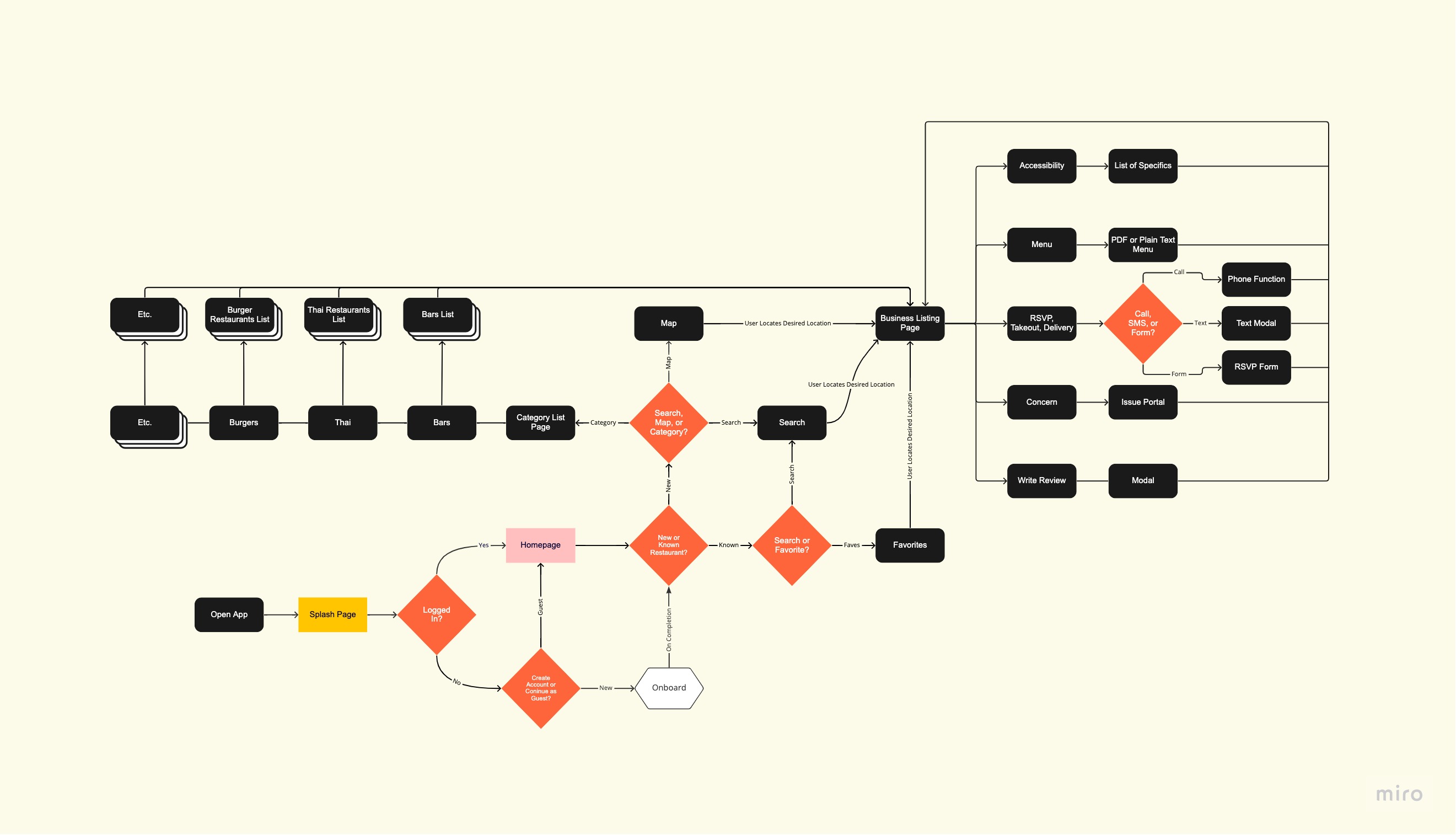 The overall user flow.
Converting user flows to sketches made me carefully consider what elements were most important and how to best organize copy and UI patterns. I included only the details users would need to accomplish tasks found in the initial usability test. Even so, it was challenging to fit everything into a mobile viewport.
Additionally, once I began to sketch the screens, some of the user flow (routes?) proved nonsensical or convoluted. After fixing these errors, I made a prototype in Marvel POP and began to test the design with users.
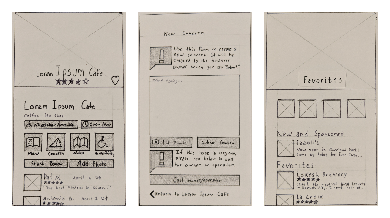 A selection of sketches.
I asked users at a bookstore to test the app with a series of tasks designed to validate usability. Overall, users were receptive to the idea, but testing revealed numerous issues:
"I like the design — it works — but a lot ... of it runs together. There's too much ... stuff." Josh K
"I didn't see the 'concern' ... icon there to begin with ... Had I seen that, I probably would've got it right away." Becky R
While this testing method was a requirement for the project, I would not repeat this testing style again. Time spent creating a prototype in Marvel POP would have been better spent proceeding directly to wireframing and validating hypotheses using Zoom. This would have reduced the burden of finding local testers and substantiating design decisions.
Using the sketches as guides, I rapidly wireframed the MVP in Figma. Because I focused solely on designing screens for routes requiring validation — ignoring many of the pages established in the user flow — I could focus on getting the prototype in front of users as fast as possible.
In addition to these screens, I also designed for a handful of edge cases:
Embracing lean methodology here meant not belaboring the design process: Default font, placeholder images, unstyled UI patterns, and AI-generated Lorem Ipsum ensured a rapid production time. Less time spent on elements that "don't matter" means quicker hypothesis validation.
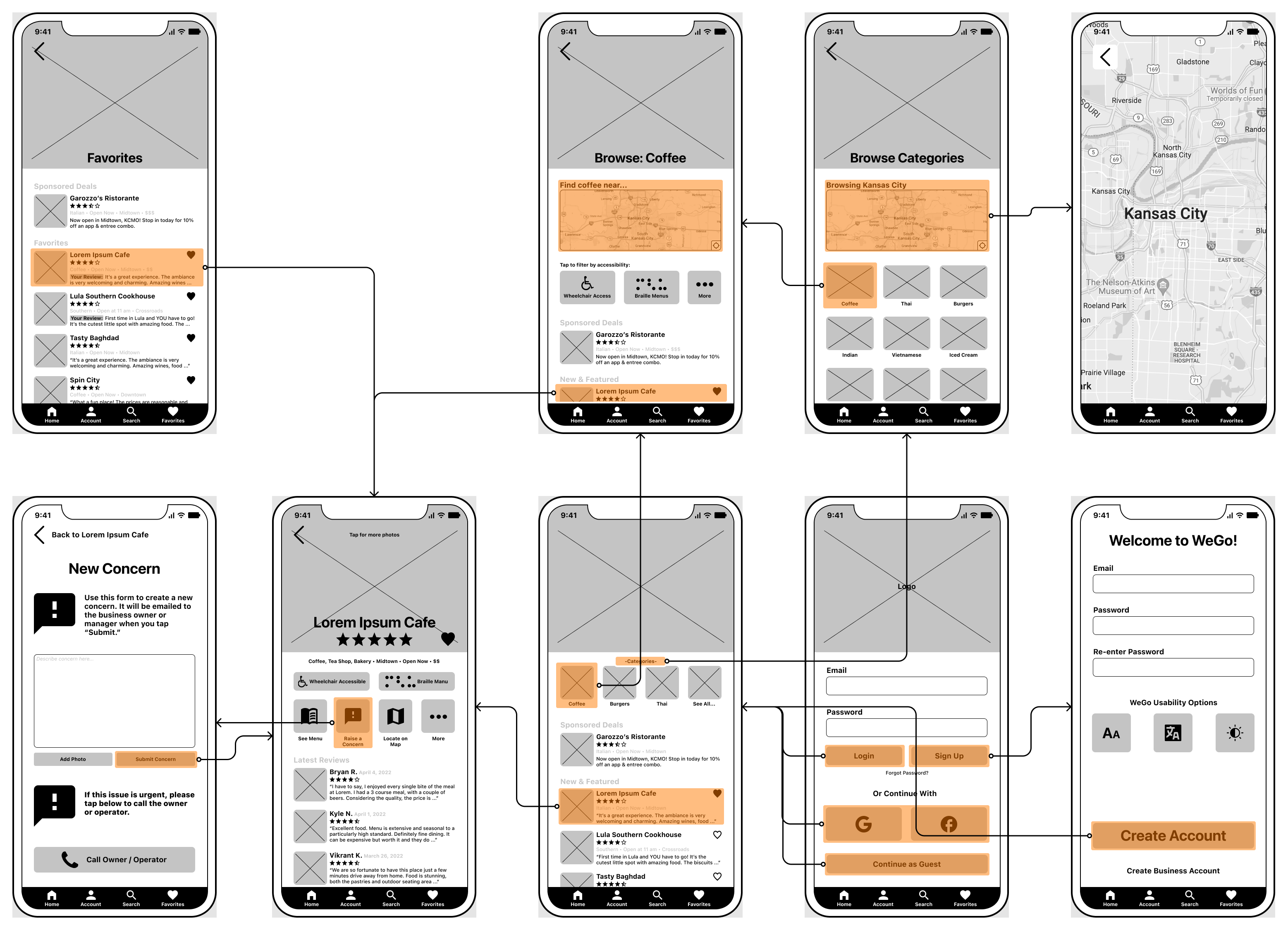 Wireflow.
Taking semiotics, color association, and tone in account, I composed a style guide positioning the brand as being focused on trust and reliability, two values established in the research phase as being of paramount importance.
I selected blue as the primary color, as color psychology indicates blue as being confident, supportive, and calming, feelings I wanted to cultivate while using the app.
Moreover, interactable UI patterns were designed to meet or exceed the minimum tap target size recommended by Apple and Google.
Finally, all colors were tested for contrast ratios and adjusted as necessary to meet WCAG 2.1 standards.
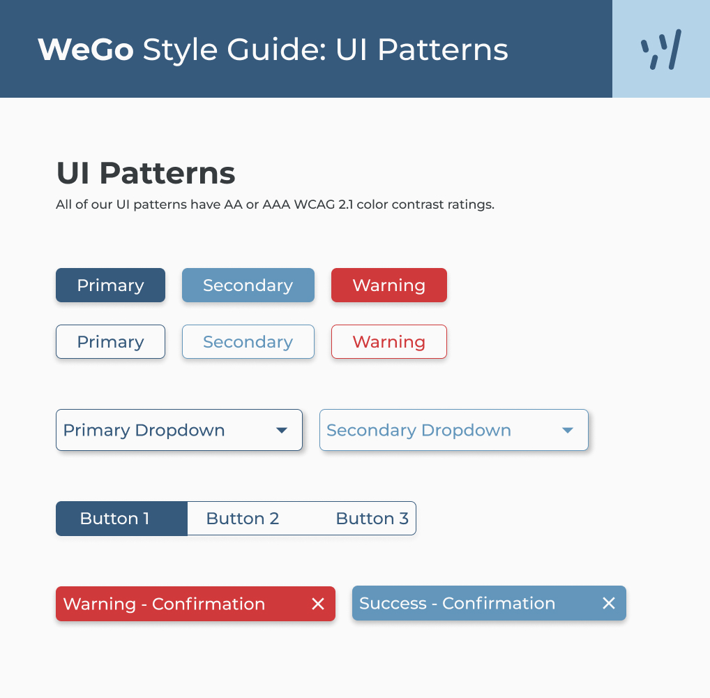 A sample page from the style guide.
I designed and prototyped high-fidelity screens based on the user feedback from wireframe testing. The prototype included new screens that were left out of the wireframe version, which focused only on the MVP and related tasks. Animations and screen transitions were also added to this stage of the product.
Important user feedback:
"[The hero image] makes me question if this is specific to restaurants." Amber H
"I feel like the icons and text over the images is difficult [to read]." Vikrant K
"So I guess the fact that [the Raise a Concern button] is bright and prominent right at the top makes me wonder if that is more the point of the app — warning versus recommending." Ashley M
 Users testing the prototype.
I iterated on the prototype based on the user feedback and tested again with 5 new users. The results of this test were improved; however, UI issues persisted.
Important user feedback:
"One thing that I need ... is a distinguishing icon where I'm at [on the map]." Ibrahim E
"Since I've already bookmarked [these locations], do I still need to see the icon on [the Favorites screen]?" Sharad C
A final iteration was made on the prototype prior to readying the design for handoff.
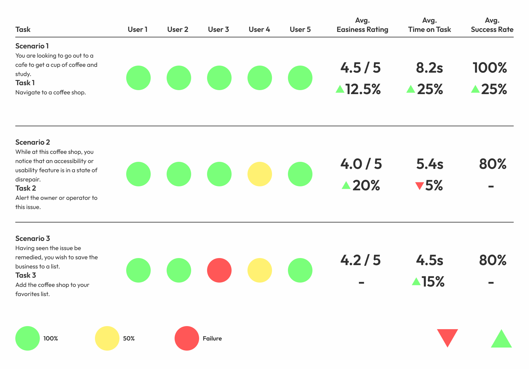 Validation scorecard.
Opportunities for improvements will always exist, but at this point in the design process, the product was ready for handoff.
User sentiment tracked during the high-fidelity prototyping phases indicated success toward shifting users from similar platforms to WeGo.
"I would use this ... in a heartbeat instead of Yelp." Becky R
"We need this now." Akshaya G
Additionally, data collection showed positive performance between iterations as well. Compared to the first high-fidelity prototype, users testing the final iteration:
Given the opportunity to take on this project again, I would adhere closer to Lean UX fundamentals — more rapid iteration and validation. Problems encountered later in this design could have been identified sooner and less time could have been spent fixing interface issues.
Ultimately, the product was a success by all accounts and provided a valuable opportunity to learn more about the intricacies of accessible design.
Figma artifacts fileThis project could not have been completed without help from Lewis N, Becky R, Cam R, Vikrant K, Liz H, Akshaya G, Elizabeth C, Josh H, Elizabeth H, Mike B, Greg G, Ethan M, Josh K, Sharad C, Ashley M, Zoe B, Adrian Z, Ibrahim E, and Jamie W.