GramCity, a new startup focusing on photo editing, wants to expand their reach by offering users a community-driven feature set pointing them toward the best photo opportunities.
This project was completed as part of a Google Design Sprint.
No budget was allotted. The project took 5 days to complete.
The primary userbase of this product are social media users seeking the best photo opportunities for posting on Instagram and other social media platforms.
As the sole product designer, I was responsible for sketching solutions, designing a prototype, and conducting usability testing.
All work was completed in five days following the Google Ventures design sprint protocol.
GramCity is a photo-editing app designed to improve the visual appeal of photos meant for Instagram and other social networks. It is the startup's goal to add a feature that allows users to find locations for photo opportunities — this is my main concern on this project. The goal is help users find locations near them, such as:
I do not have to design for the photo editing features, only the location feature — that is, helping users find locations for photos is the primary objective. Additionally, I need to create a community function to allow users to share their favorite locations.
Research shows there are two location types users want to see: hidden gems and touristy spots. Of those types, there are subcategories: architecture, public art & design, etc. Food was not mentioned, and food photography is popular on Instagram; however, in the interest of time, this addition will be relegated to future iterations.
Using these personas as a guide to develop the features needed to satisfy the project's goals, I composed HWM questions to help aid in my design:
I am aware of the problems and limitations surrounding HMW statements. In the absence of suitable alternatives, HMWs suffice, but the product dsigner is aware of their shortcomings.
Having studied the personas and composed HWMs, I developed two user story maps. These would serve as the basis for my sketches.
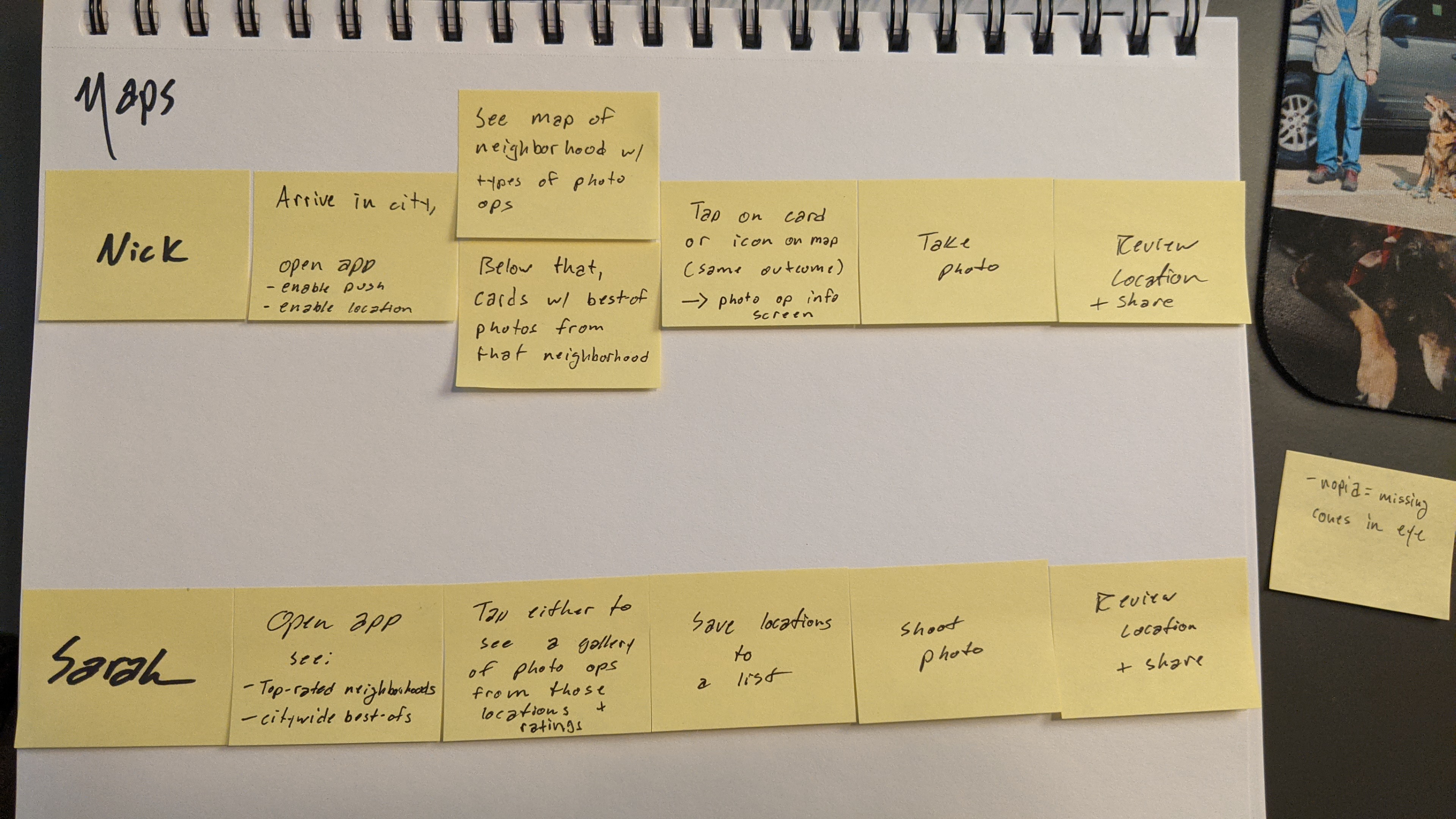
Maps.Personas (provided by GramCity) gave me an inside look into what the users felt was most important to them. Therefore, I paid attention to sites that allow users to find specific information about photo ops as well as sites that ranked photo ops, so a user who was concerned with finding the “best of” would be satisfied.
I identified the first step (home screen) on the map as being the most critical, as it deals with a commonality Nick and Sarah have in common: research. This screen was chosen because while the two personas differ in their approach to research (Nick doesn't have time; Sarah will make time for it), both directly affect another aspect of their goals - efficiency and assurance of time-investment payoff.
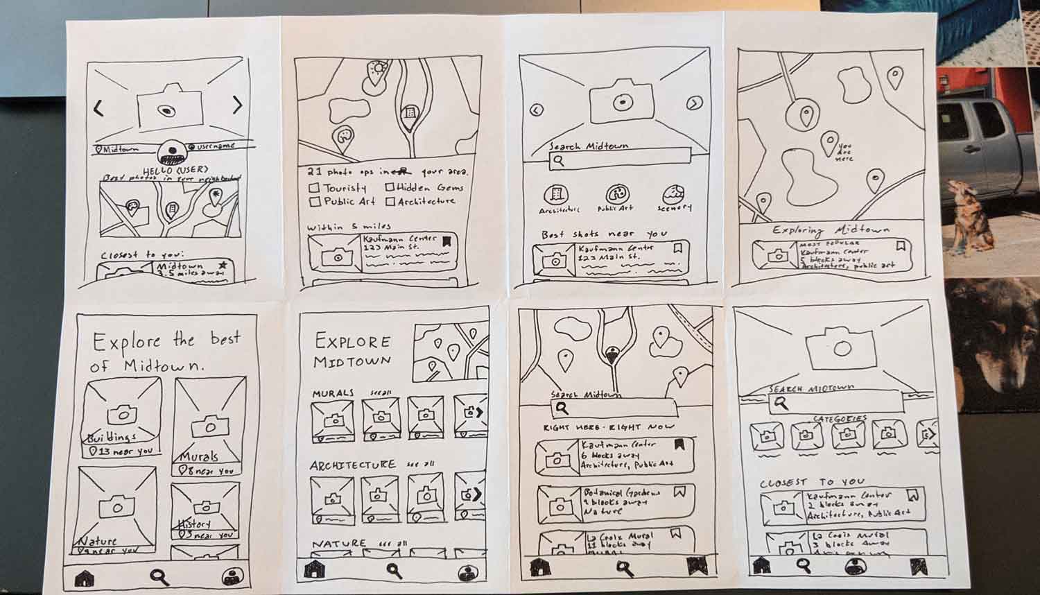
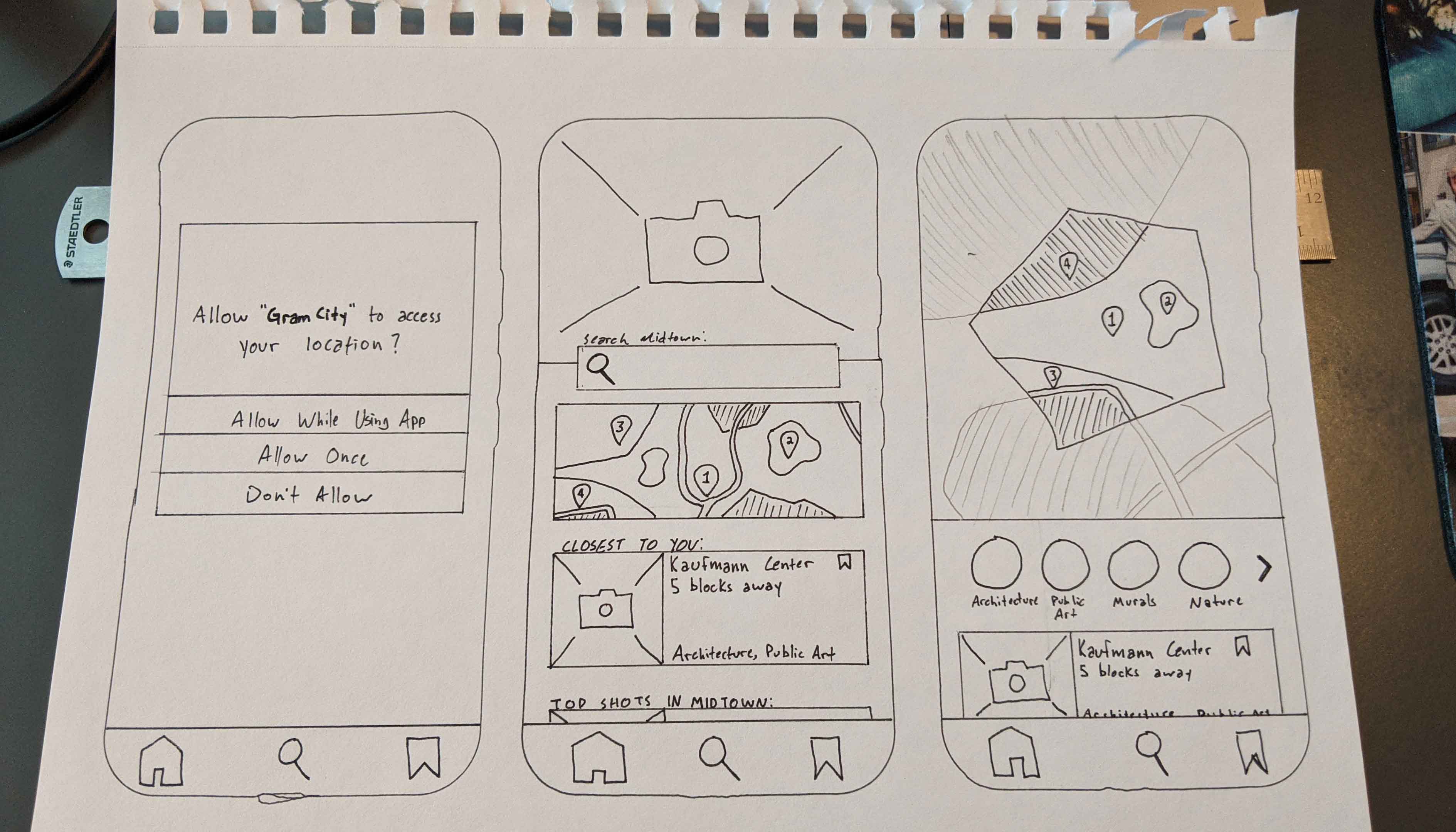
I used the Crazy 8s method to rapidly sketch different ideas on how this screen could appear.
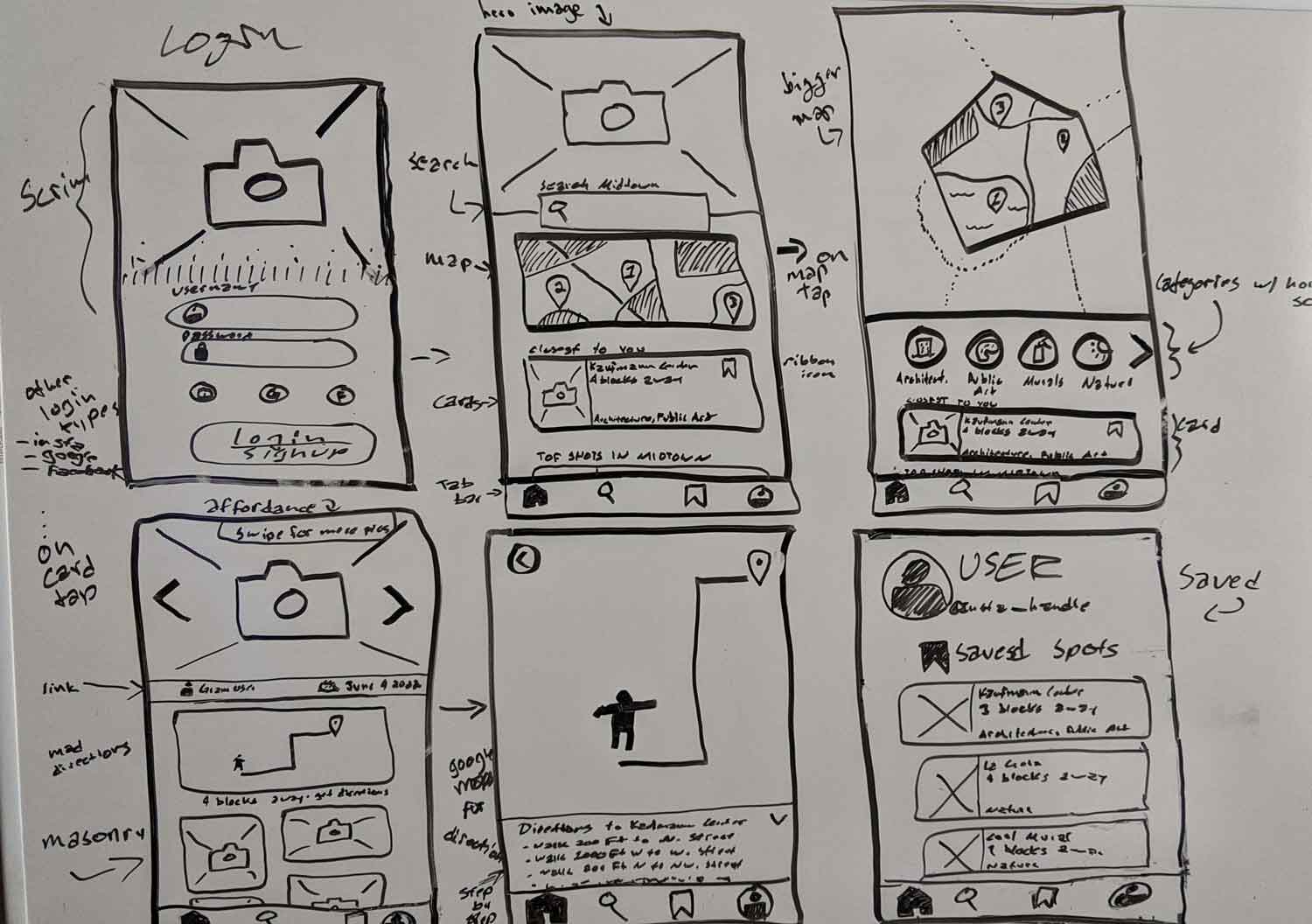
Starting with the solution sketch from the previous day, I created a storyboard that illustrated the path the user would take to arrive at their goal. I included all key screens, including the map and “saved photo ops” screens, to accommodate both personas' needs. UI patterns and design notes were indicated with arrows off to the side.
I opted to use a dry-erase board to create these designs, as it allowed me to rapidly visualize the UI, while also offering the freedom of being able to alter and erase ideas that were not optimal.
I chose to prototype in Figma, since I know it best and can generate design fairly quickly with it at this point. Using the personas, HMWs, and sketches, I focused on providing users with information regarding immediate photo opportunities while also allowing users to save locations for upcoming trips. Users can also enable push notifications to be alerted when they are in the vicinity of a photo op.
Regarding the process, I am glad I decided to use Figma, as it allowed me to swiftly create high-fidelity screens with smooth screen transitions and interactable objects. While some screens were more of a challenge to design than others, the time constraints forced me to choose a design and stick with it, rather than iterating on possible ideas.
I interviewed 5 users, all of which were recruited via Skype. I was able to complete the entire round of testing in 24 hours, which was in line with the intended speed of the design sprint. When compiling the list of user comments and issues, I color coded the recurring problems, which aided in ranking their severity.
Testing goals included ensuring participants understand the location of the saved locations, how to enable push notifications, and finding out whether or not they trust that a location (Kauffman Center) is the best location for photos - i.e., whether they felt confident that the location offers "best-of” subjects to photograph.
"I can't tell if one side [of the toggle] means on or off ... I'm not sure." Meg P
"I'd prefer to see [an 'X' icon] to close the pop-up. That's what I'm used to." Nancy L
"The search [input] needs to be a little bit clearer." Pragya S
The following issues were ranked based on user feedback frequency:
Positive user feedback let me know I was on the right track, but negative feedback was the most valuable, as it pointed to improvements I could make when iterating.
I am extremely thankful to the participants (Meg P, Nancy L, Pragya S, Liz H, and Megan B) for their time and input.