Rivera
Simplifying decentralized finance for investment managersOther products & projects: WeGo GramCity Cima

Investment managers are often overwhelmed by cryptocurrency investing options. Designing a simple, easy-to-use platform for investment managers to use in order to achieve their clients' goals.
The scope of this revolved around wireframing and prototyping based on stakeholder's initial designs.
No budget was allotted. The project took 6 weeks to complete.
The userbase for this product are primarily investment managers WORDS.
As a member of the product design team, my responsibilities included wireframing, style guide creation, and low- / high-fidelity prototype creation.
Before meeting with the stakeholders, our team gathered to introduce ourselves and discuss our strengths and design preferences. Of the four of us, I was the only one with prior investing, crypto, and FinTech experience. This was a positive for the team, because while I had experience with similar products. This also meant I had biases concerning appropriate design specifications, whereas the other team members would start fresh.
While the stakeholders had performed user research prior to the beginning of our internship, the design team was unable to gain access to these findings. This put the design team in a challenging situation: We had no firsthand knowledge of the user or their habits, and we were not able to synthesize the research.
Without synthesis artifacts & affinity maps, empathy maps, personas & our team lacked a clear picture of the user we were designing for. We understood the necessity of not sharing all information, given the sensitivity of the data, but having to rely solely on a condensed version of the findings put us at a disadvantage.
 Meeting with the stakeholders.
The stakeholders provided our team with screens they had created in Figma, including the foundations of what would become the style guide. Every page we were to create was provided, giving us a head start in the design process.
Our first task was to develop a user flow diagram of the screens in order to have a top-down understanding of how the product works from a user's perspective.
Each team member had a slightly different understanding of the user flows at the beginning. With input from the stakeholders, we were able to finalize this understanding of the product pathways.
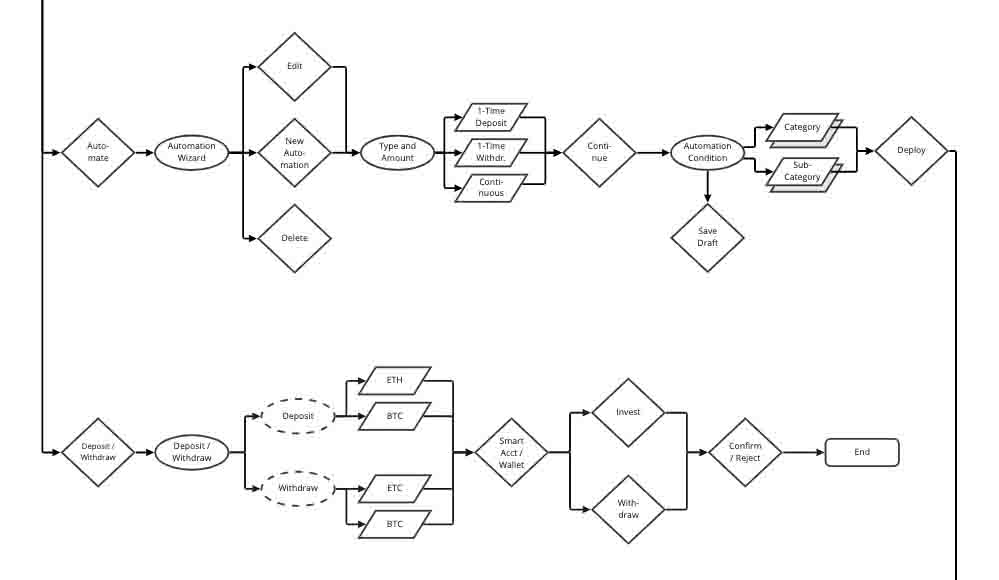 A portion of the user flow.
The stakeholders provided our team with links to similar products in the DeFi space that they wanted us to base our designs on. The team researched the layouts of each site and determined the basic visual style for each.
Having examined competitors' products and consulting with the stakeholders, our team determined the following layout parameters:
I presented these findings to the stakeholders, which they accepted, and the design team proceeded to develop wireframes.
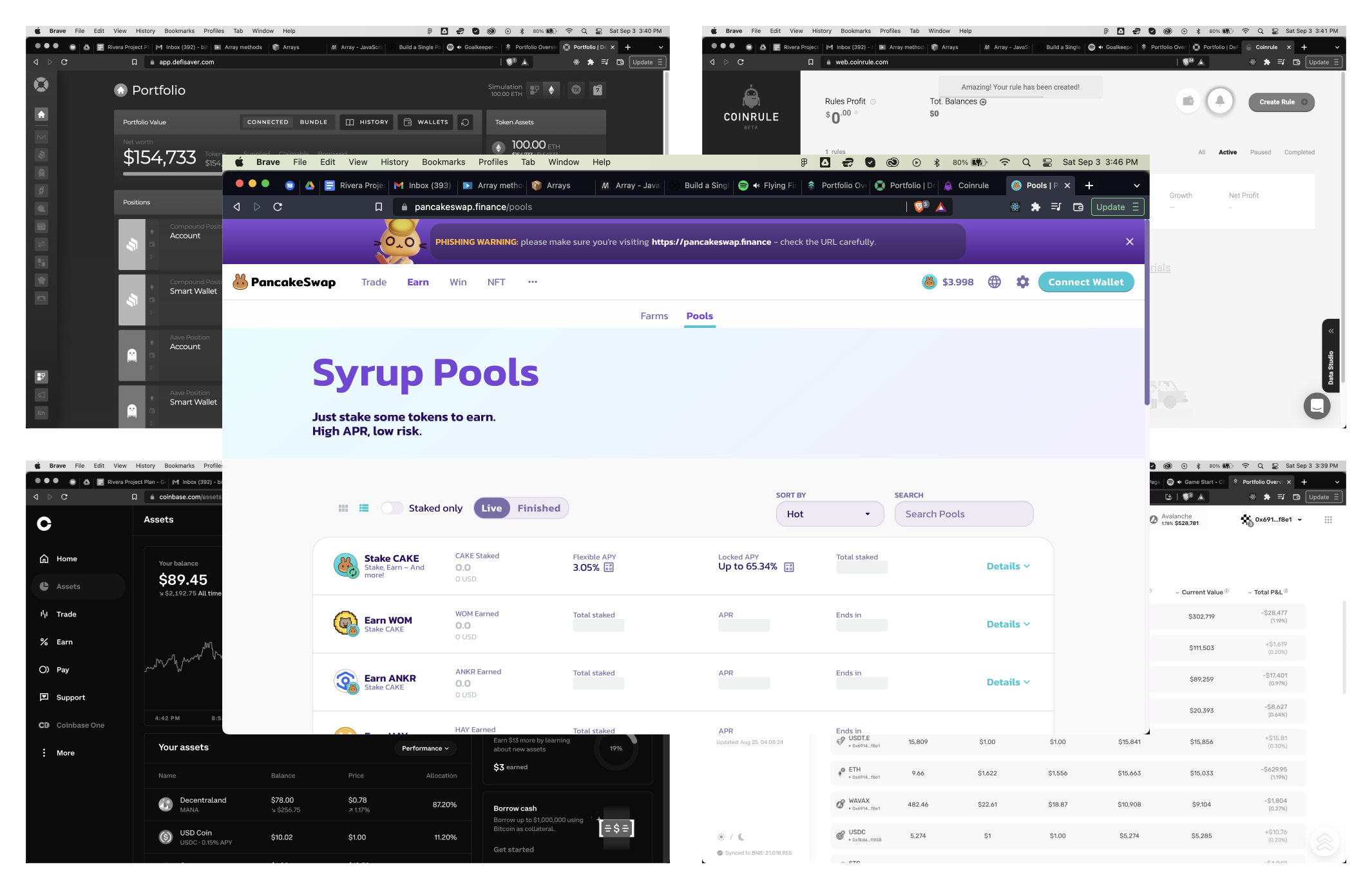 Five of the competitors analyzed.
I counted and divided the number of screens (by type and flow) provided to us by the stakeholders and each design team member chose pages to work on. I streamlined the design process in Figma by componentizing reusable assets.
Minor issues arose at this junction because the team had differing opinions on the minutiae of design, including:
This resulted in minor inconsistencies between each member's wireframe designs which needed to be normalized prior to submitting designs to the stakeholders for review. Clearer communication would have alleviated or mitigated most of these concerns, however the asynchronous nature of our work meant our meeting times were limited in frequency and length. Though an additional two days was required to standardize the screens, we submitted them for approval and testing.
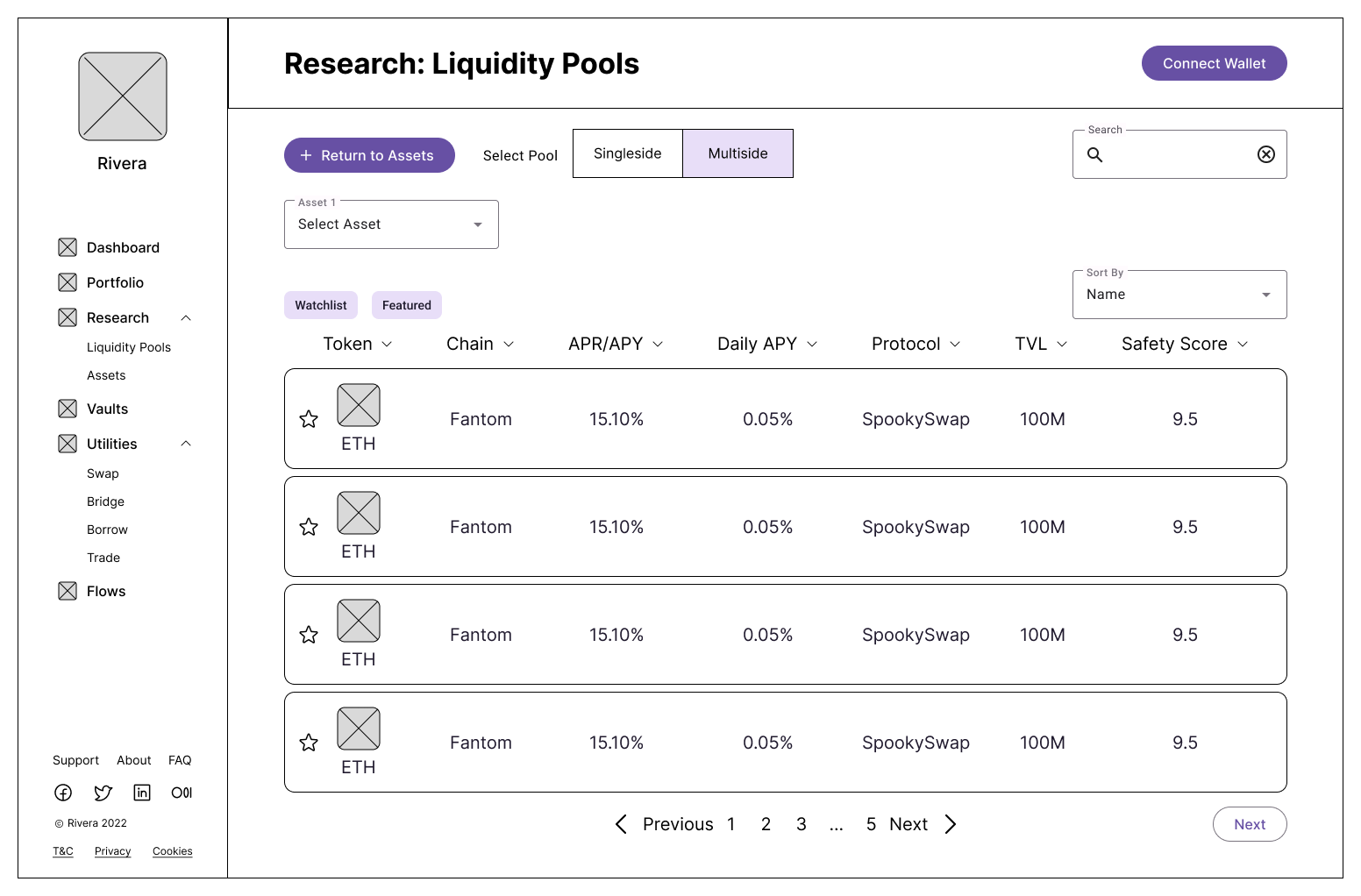 Wireframe.
I composed the usability test script and submitted the document and the Figma screens to the stakeholders, who ran sessions with users with tasks related to navigation, comprehension, and accessibility. Task completion rates were high, and the improvement notes were mostly related to unnecessary steps in the user flows.
While we were pleased that our wireframes had succeeded in their design, without access to the testing results meant we had an incomplete understanding of the exactness of the problems found.
It was during this phase the team had to reconsider the timeline. Persistent delays in delivery required us to request an extension to the time allotted for the internship, which the stakeholders granted. We updated and submitted the timeline document and began to design for the style guide.
 Stakeholder notes following usability testing.
The stakeholders provided us with a color scheme, a “dark mode” palette, and it was our responsibility to develop the remainder of the style guide & the font, font sizes, and iconography. After discussing the options available, chose Material Design icons and Space Grotesk as the font. Cryptocurrency icons were taken from sources such as CoinGecko and CoinMarketCap. Colors were changed slightly in order to meet minimum color contrast ratios for accessibility. Once approved by the stakeholders, our team began work on the high-fidelity prototype.
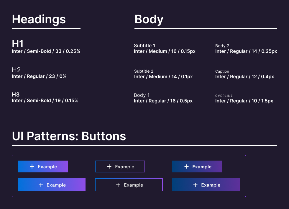 Style guide sample page.
Our team combined the results of the wireframe usability test results with the color palette to produce a high-fidelity prototype. Difficulties arose when designing for the tables present on most pages, as the data density meant some of the columns were too close to each other, resulting in entries running together. This problem was assuaged by altering the font size and rearranging the icons.
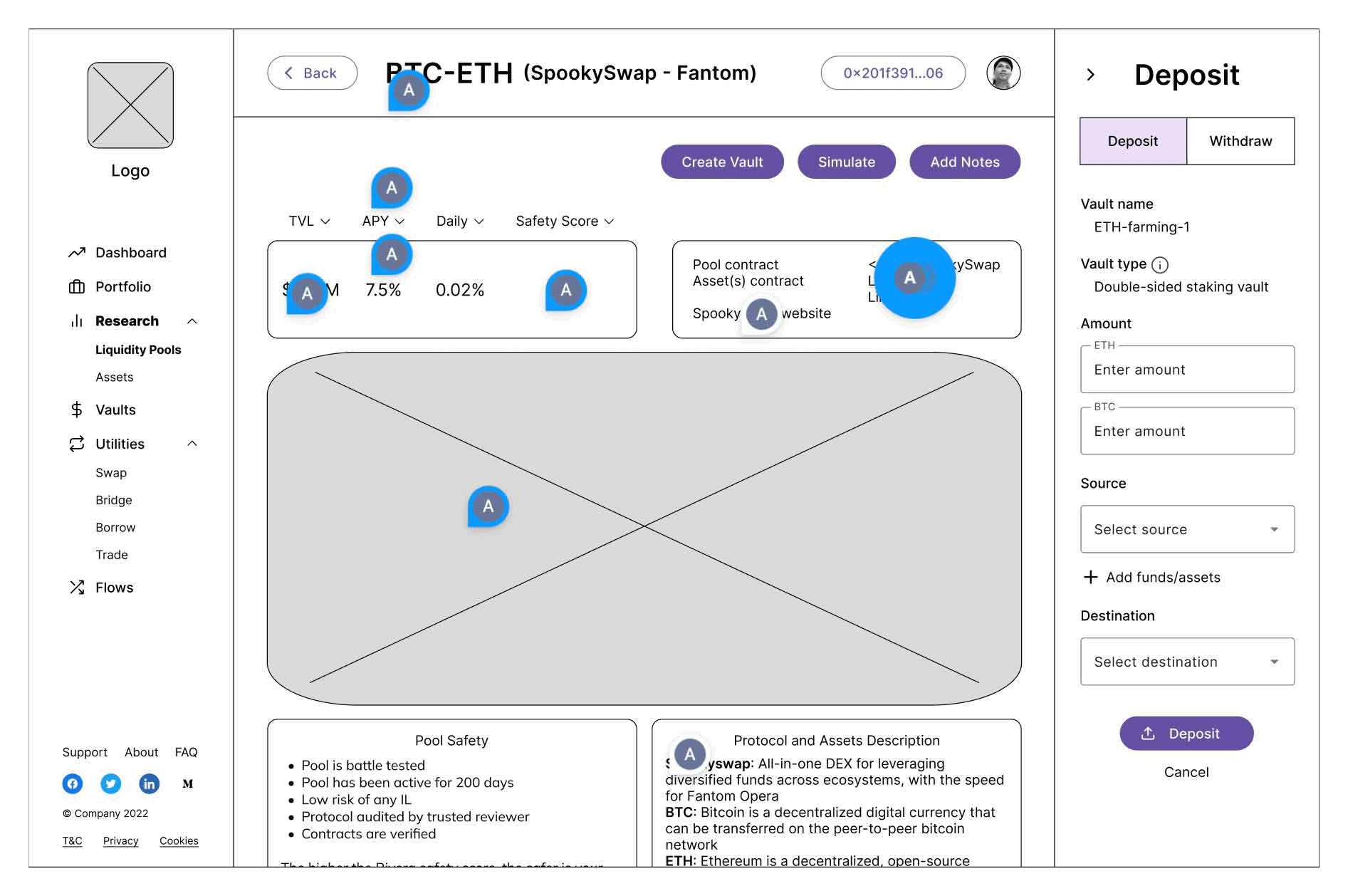
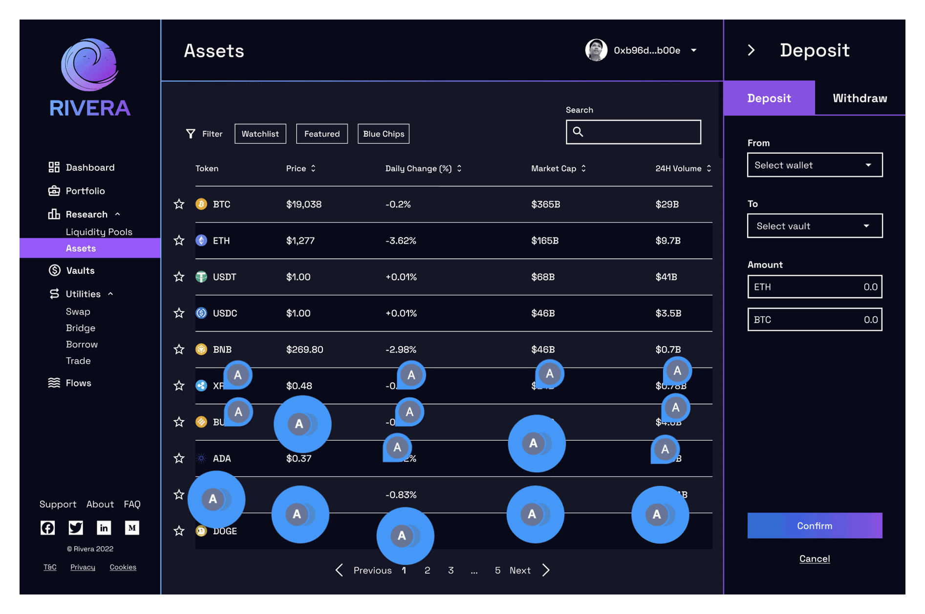
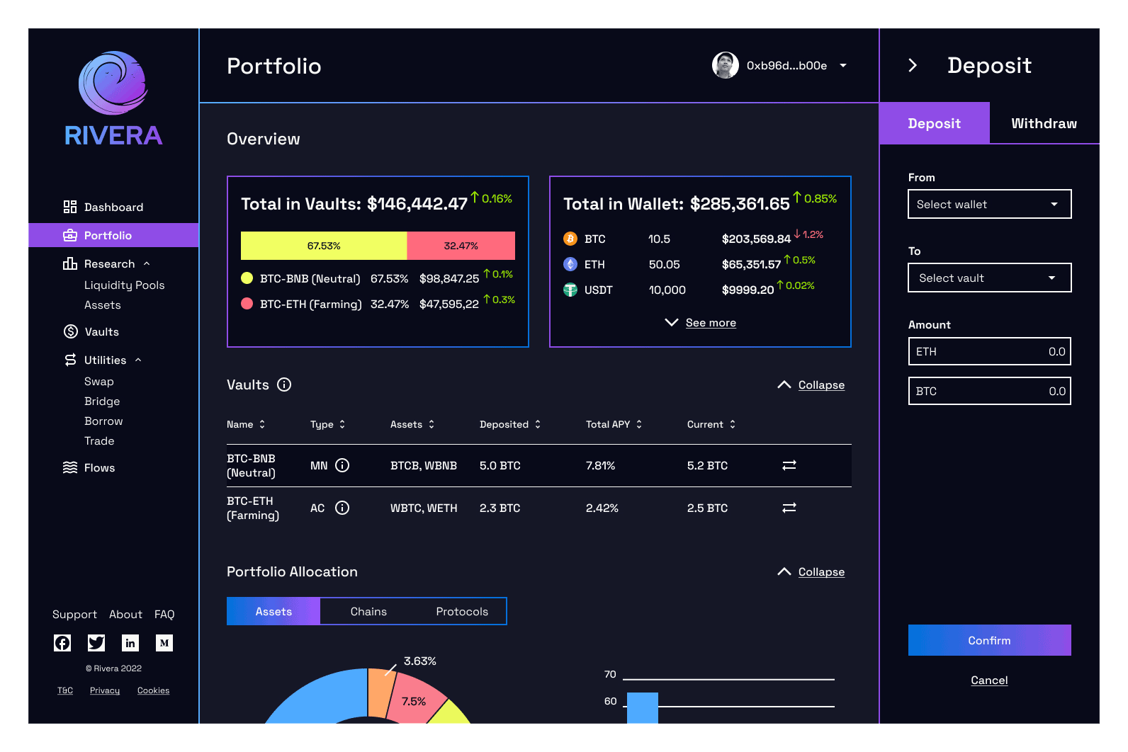 Screen from the high-fidelity prototype.
Our stakeholders conducted a round of usability testing and users encountered only a few issues:
We processed the findings, iterated on the design, and submitted the final version for approval.
 Stakeholder notes following design validation.
Despite the multiple challenges found in the externship, being flexible with the direction of design allowed us to quickly and easily adapt to the shifting nature of the requirements of the project. Additionally, the vagaries of the production schedule resulted in our scope shifting more than once, so being malleable allowed us to switch focus easily.
Better communication and closer tracking of the timeline could have alleviated some of the problems we encountered as a team, but working past the original deadline did provide an impetus to embrace some aspects of lean methodology, i.e, developing quickly and relying on user feedback instead of belaboring the design process with debating over UI patterns and font choices.
Ultimately, the IDP provided a window into some aspects I expect to find in my future career as a product designer. Of particular value was the interactions with stakeholders and learning to view and understand things from their perspectives as owners who are financially invested and dependent on the success of the product. Learning to think from this perspective has broadened my understanding of the design process and made me a more well-rounded designer.
Thanks to Akash A, Akshay S, Lewis N, Jacob L, Eva K, and Anna B, without whose support this project could not have been finished.